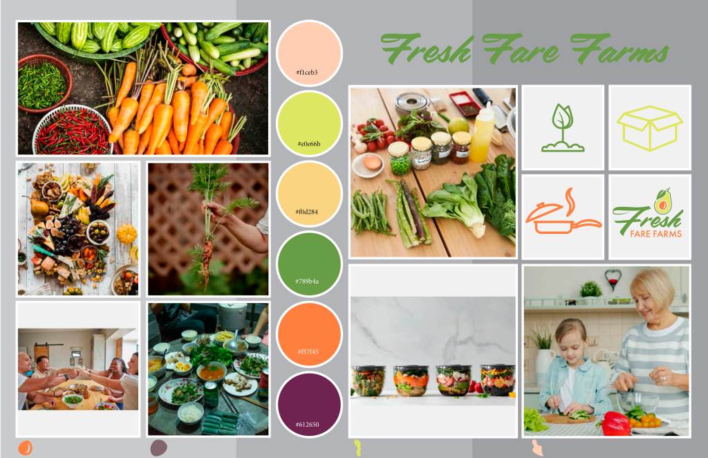
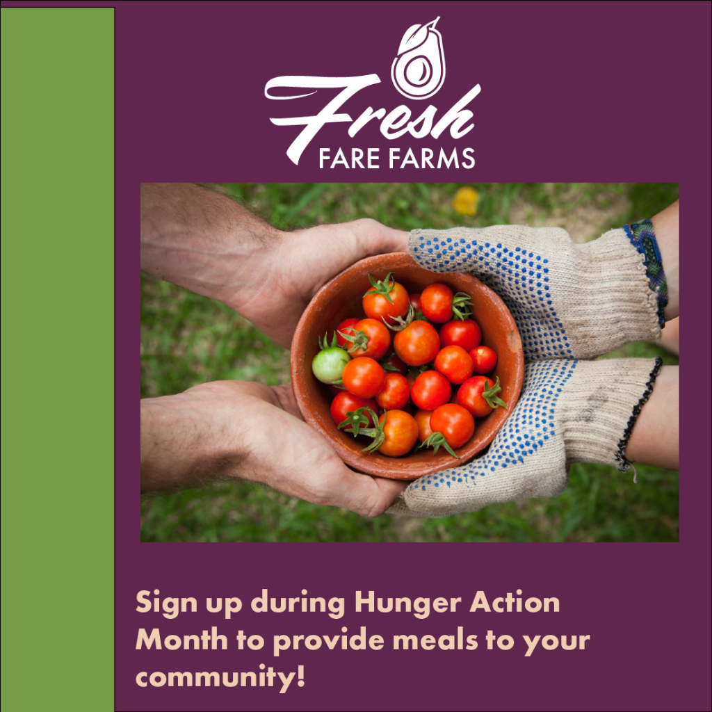
This was the start of a multi marketing campaign. I needed to complete a mood board to explain to stakeholders which direction I was planning on taking. I used competitive research and Pinterest to gather inspiration and then I used the brand style guide to pick the chosen colors, typeface, images, and shapes. After all the elements were chosen, it was just about setting up the layout in a clean and clear manner so that it was easy to read and the stakeholders could see exactly what was in my head.
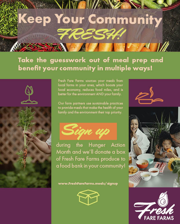
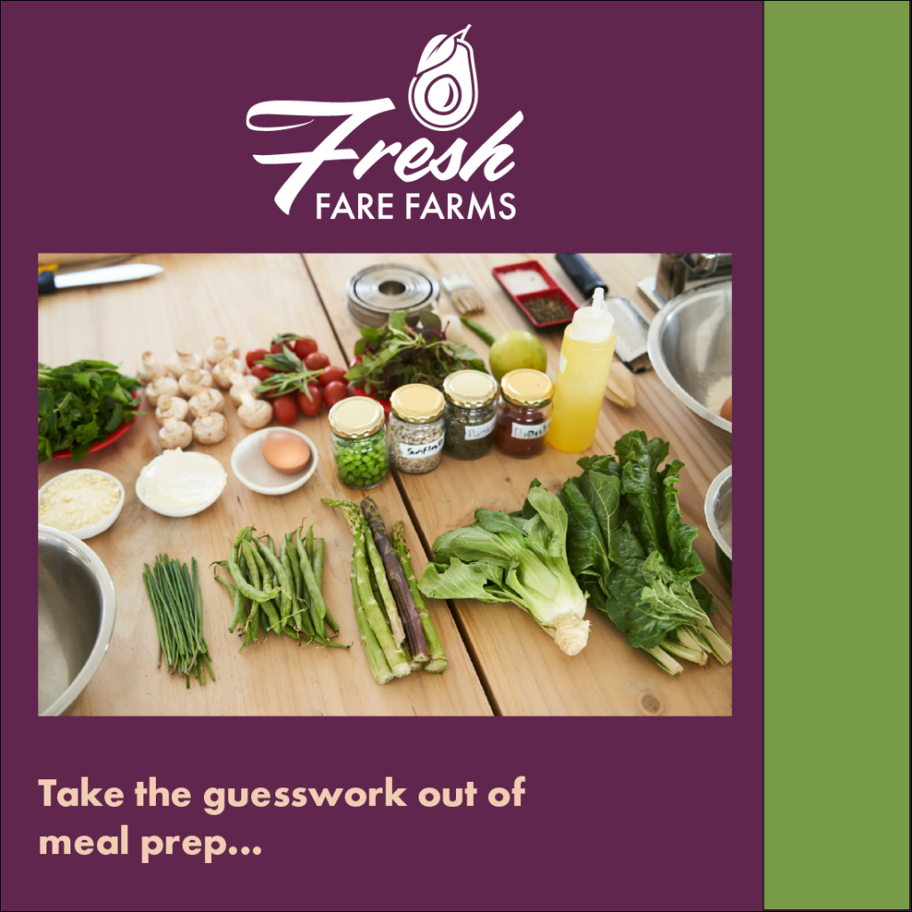
I was presented with this assignment in my Multichannel Marketing class. The problem was that the company had needed a multichannel advertisement that would reach their target audience on multiple platforms. I began this project through competitive research. I looked into the different design elements that were being used by other companies that offered similar services. The main goal was to increase sales and boost awareness. The client needed a magazine advertisement, a social media banner, and an image carousel that was consistent and appeared to all come from the same company. This was accomplished through the use of color, typeface, and overall tone of the images.
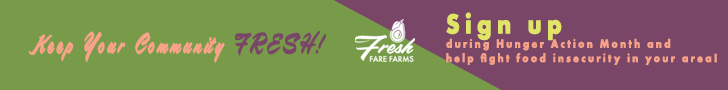
This is a continuation of the multichannel marketing campaign. It is a carousel banner that was intended for a social media advertisement. The purpose behind this advertisement was consistency. The client wanted advertisements that were consistent in look and feel. That way it is easy to see the company behind the advertisement.
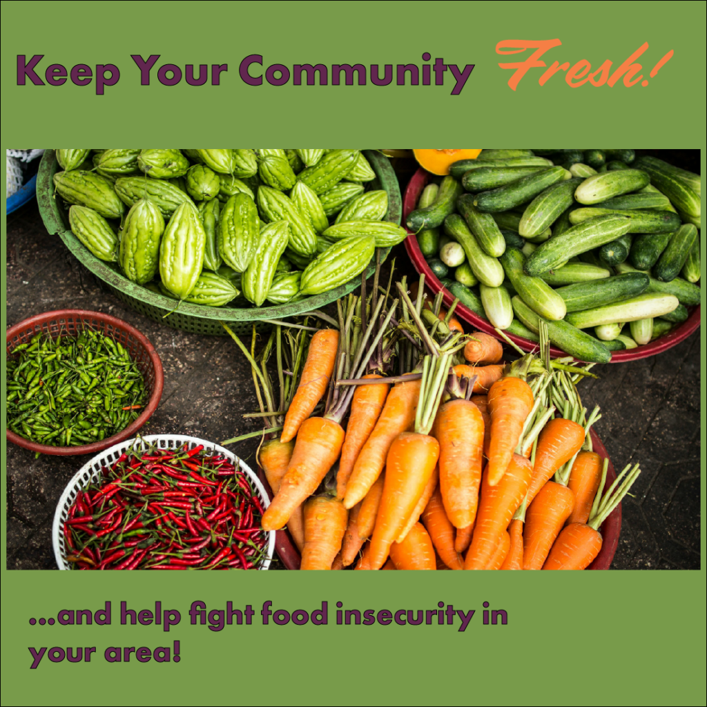
This is the last piece to my multichannel marketing campaign. The ask was for an animated call to action that grabbed attention. I chose to keep everything similar in color, type, and the logo in order to keep everything the same while still maintaining visual interest.
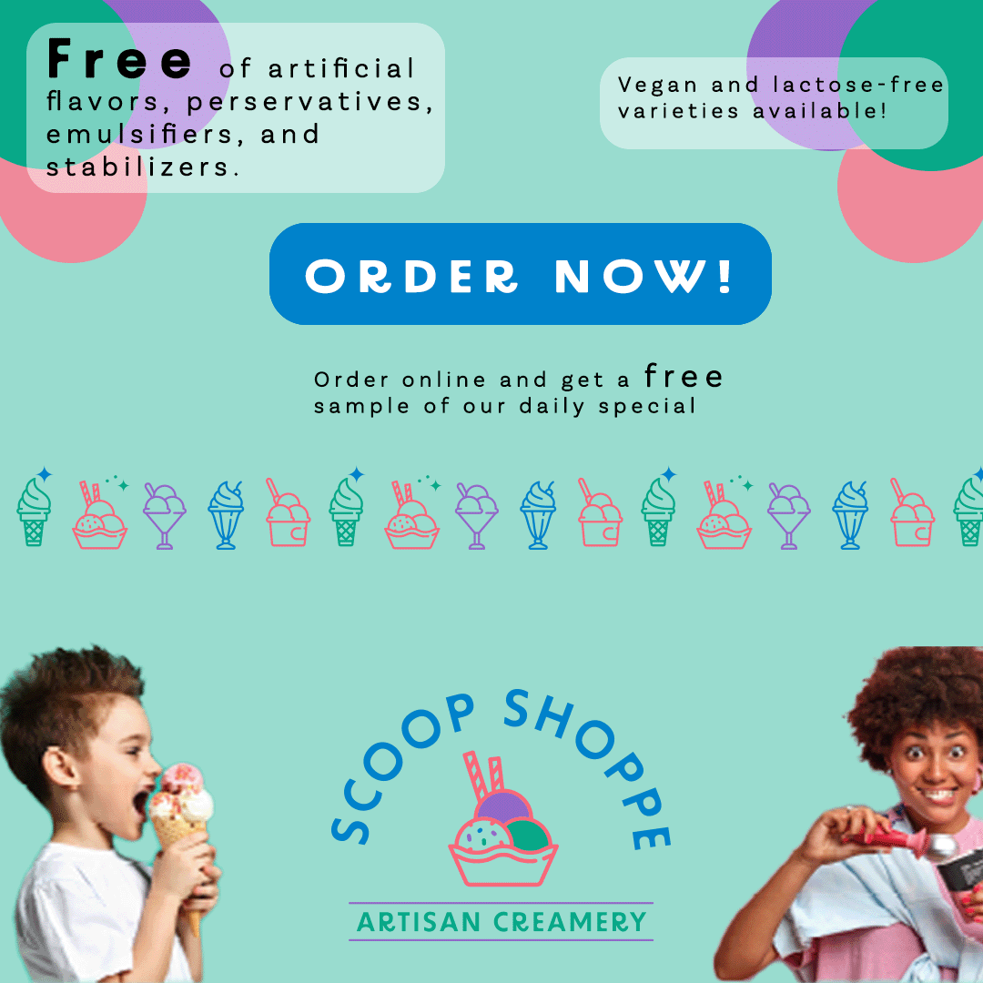
This project was also presented in my Multichannel Marketing class. It was for a fake ice cream company. The problem presented was that they needed a fresh new campaign that appealed to a younger generation. The first step, as with any design project, was competitive research. My research showed the use of fresh colors, images showcasing younger people enjoying their products, and a clear, bright call-to-action button. This was accomplished through use of bright, bold colors, a clean sans serif font, and an animated call-to-action button, which grabs your attention and gives the desire to press it. Everyone likes to push buttons!
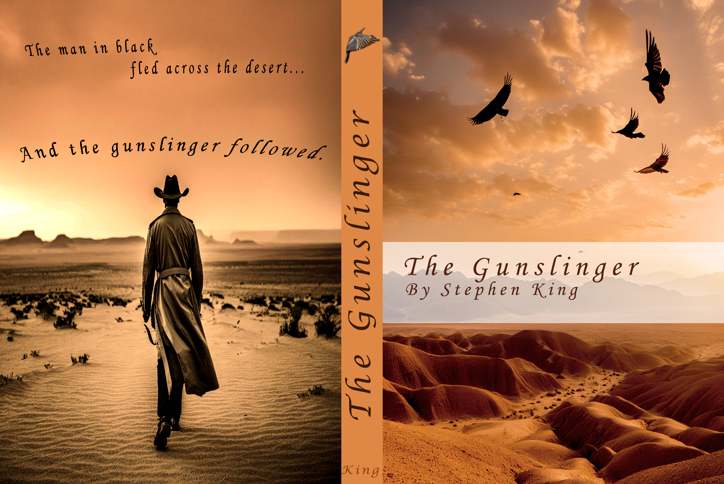
This was a book cover that I designed for my favorite book, The Gunslinger by Stephen King. For this project I searched my own book shelf to gain inspiration. The goal of this project was to create an enticing cover that draws readers in without giving away too much information. I did this through the chosen images and by providing a small passage from the book on the back page.
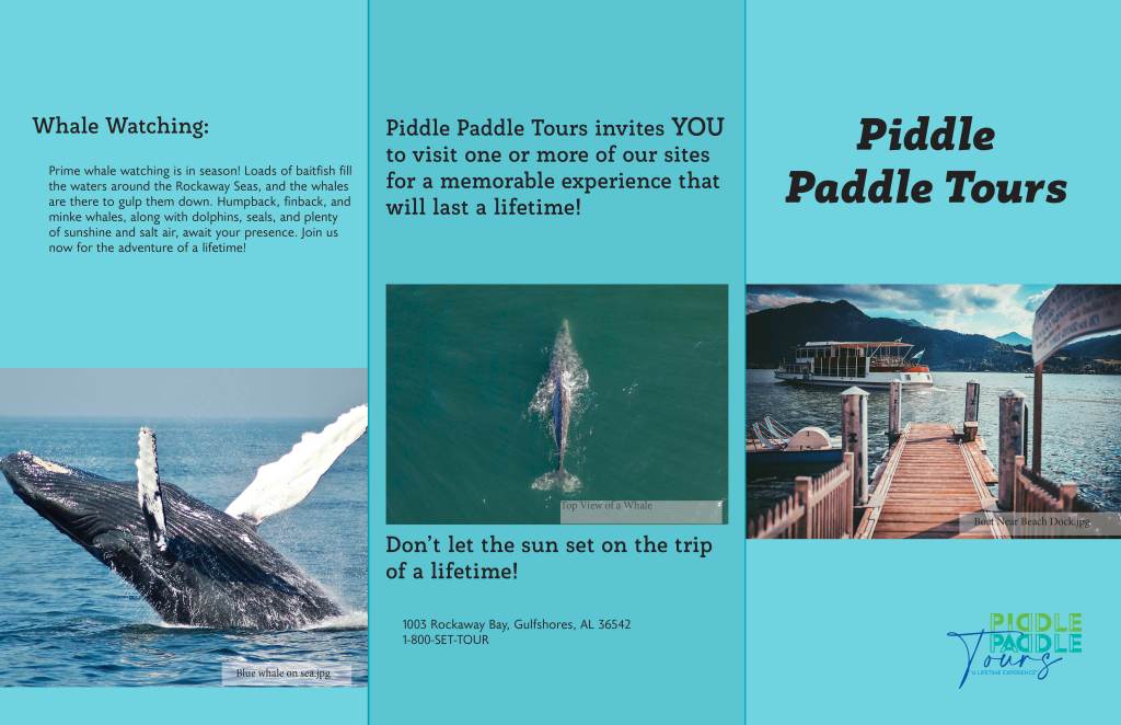
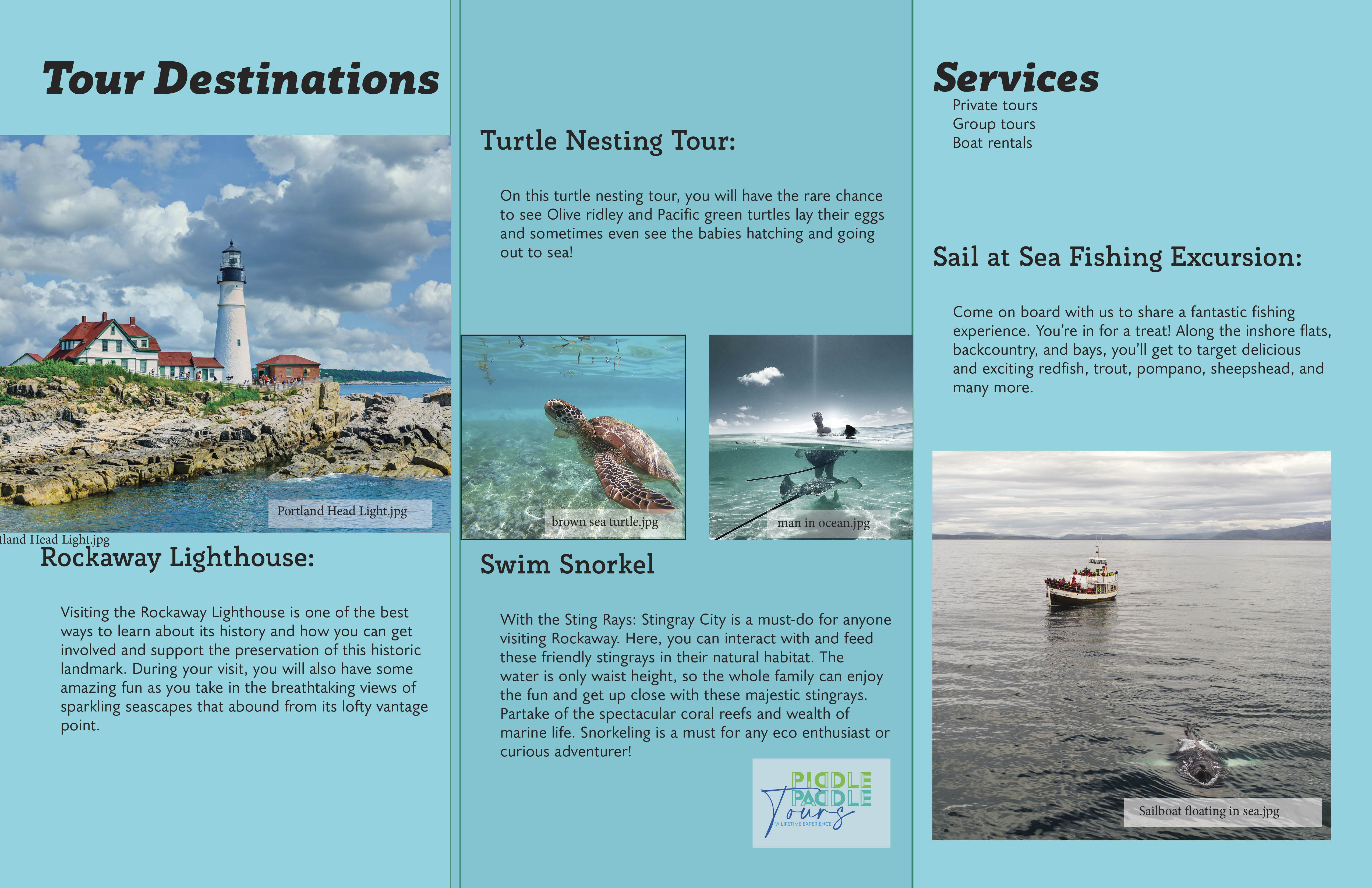
This project involved creating a brochure for a fake company that offers guided tours to tourists. The company wanted to market their services to adventurous people looking to experience aquatic wildlife. I used competitive research on other tourist companies. I discovered that most use similar colors and images to showcase their services. After choosing the appropriate colors and typeface, it was all about layout. I wanted to include all the required copy while keeping it basic and not overcrowded.
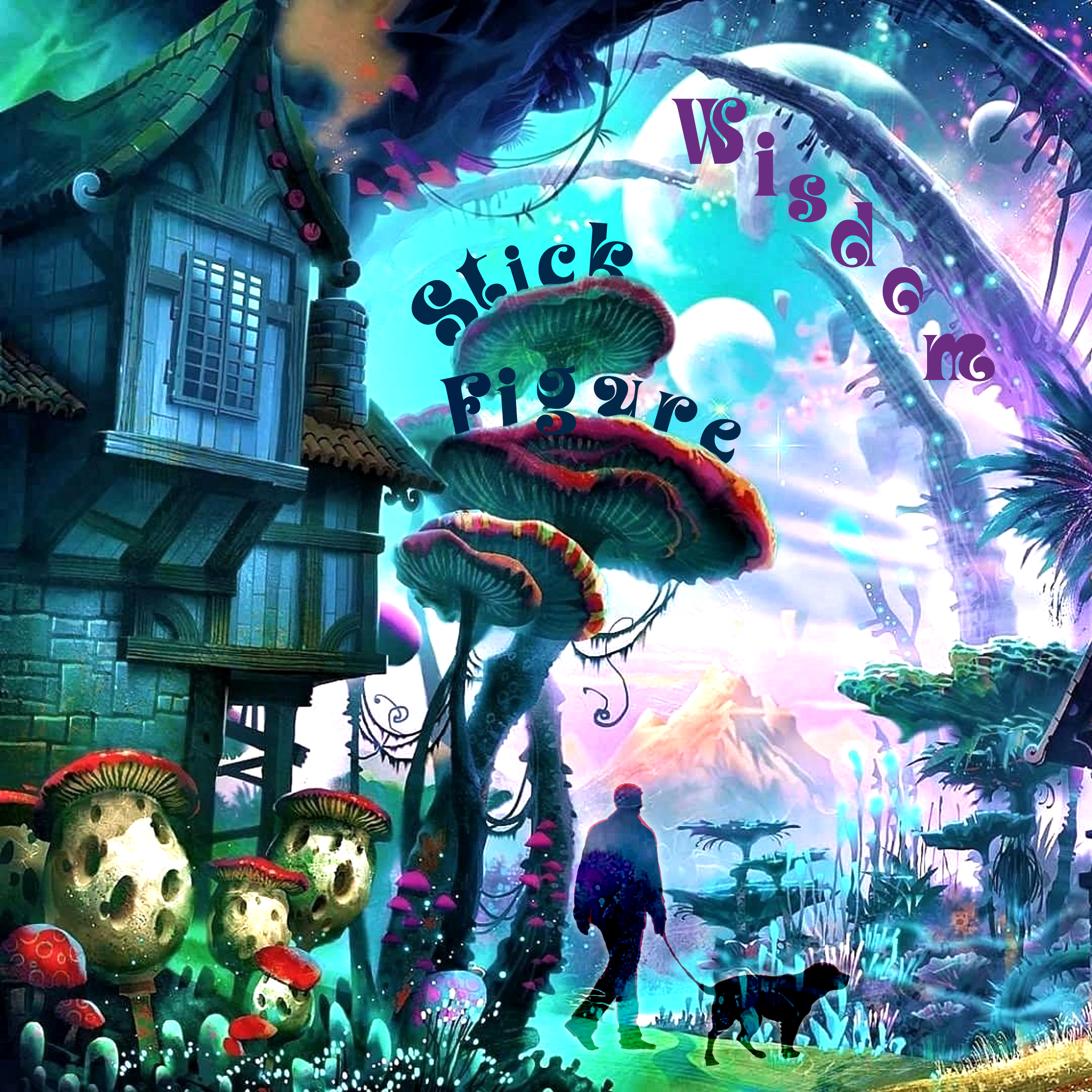
I was presented with a project to create an album cover for my favorite band. I chose to create this for the band Stick Figure, which is a reggae band whose music is on the psychedelic side. I wanted to use a background with lots of color and a trippy image to show this. I chose to include an image of a person walking a dog because the artist talks about his dog and his love for him. The typeface flows into the image as if it belongs there.
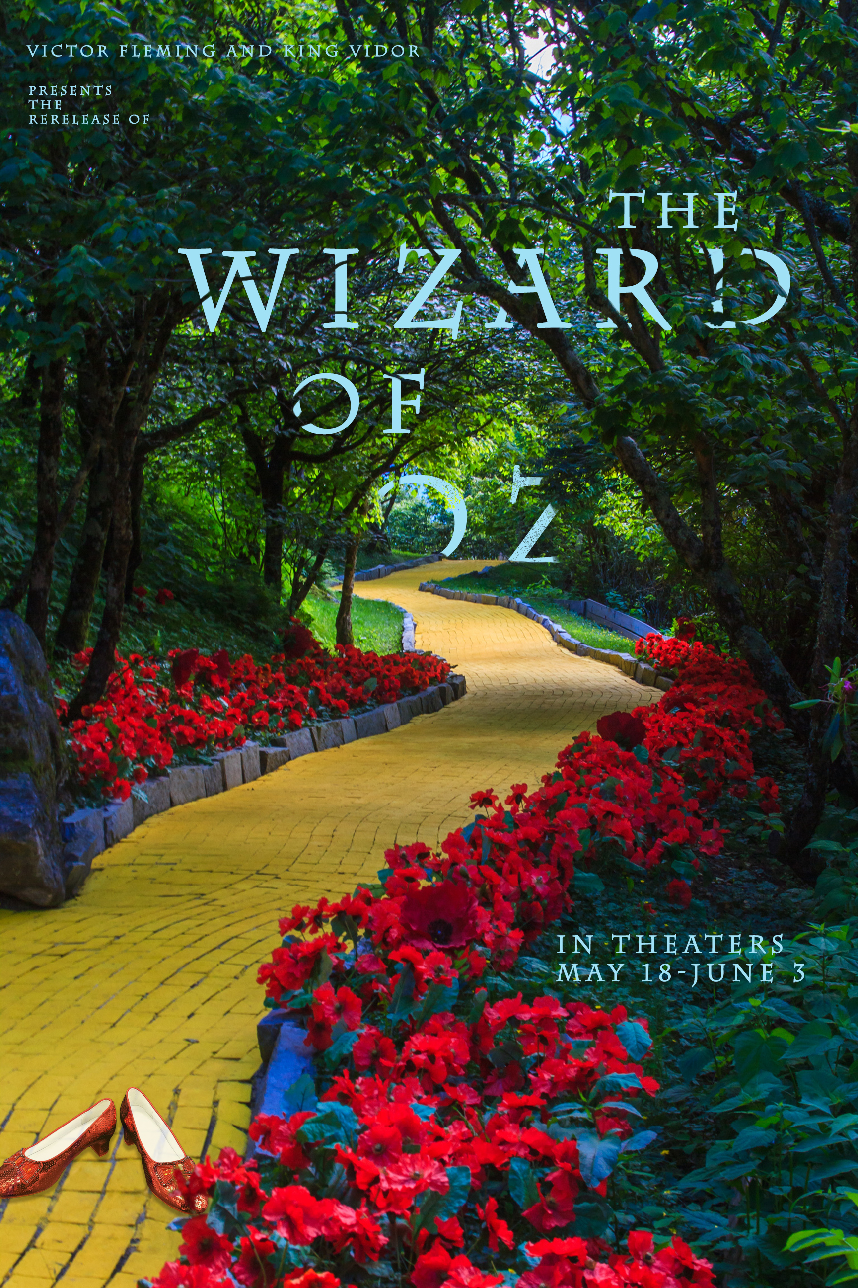
I was presented with the need to create a movie poster from a list of different movies. I chose the Wizard of Oz because it is iconic, almost everyone knows the yellow brick road. I took an image from the movie and placed a pair of ruby red slippers on the road. I also played with the title. I wanted to make it appear as though it is also following the yellow brick road.
